Now that we’ve got part 1 out of the way, and we’ve already established our farm’s identity or “brand” it’s time to put it into action. This is the part where so many otherwise great farmers fall flat.
So what’s this branding business all about anyway? It’s about immediately identifying your farm to anyone and everyone all of the time. Obviously, it’s hard to do this verbally, as you’d go hoarse pretty quickly trying to shout out your farm name to everyone who passes by in a crowded market. We need a to convey this information visually.
You can’t just slap our farm logo and name on a big sign and call it a day either. What happens when a customer buys a bag of spinach and gives it to their friend? The friend may think it’s the best thing they’ve ever eaten, but unless the bag has some sort of identifying information on it, they may never know it came from your farm. One opportunity lost.
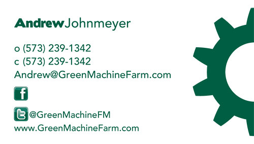
The key to successfully using your logo/brand is consistency. Consistently applying your branding is one of the most common mistakes that I see farmers making. The font, colors and feel that are used in your logo aren’t just for your logo. If you print something for your farm, a label, a CSA signup sheet, an invoice, it should use your font, your colors and should have a similar “feel” to your logo. All of your materials should present a “unified look” to your customers.
“A unified look makes it easier for anyone (new and old customers) to readily identify you. Creating a thematic “look” for your business isn’t difficult. Many aspects of promotion are already commonplace but underutilized or not coordinated: farm invoices, farm checks, business cards, signage at farmers market and farm stand, produce bags, case labels, farm truck lettering/artwork, T-shirts, hats, and stationary letterheads.”- The Organic Farmers Business Handbook, by Richard Wiswall
The big companies that you’re competing with all know the importance of branding. They all have multi-page branding guides that they distribute to their underlings. These guides list out in exacting detail the exact colors that may be used in printed or online materials, the exact fonts to be used, and even the acceptable sizes that a logo can be printed in.
So how do we brand our farms to compete with the big boys? Well, lets start out by clarifying that branding isn’t going to make our farm or products anything that they aren’t. If we grow bad lettuce, good branding isn’t going to make it sell any better. Branding is connecting your awesome product to a mental construct in the mind of your customer. To make that association stick, we have to repeat it constantly. We have to apply our branding to everything that leaves our farm, and a lot of the stuff that stays on our farm.
One of my favorite tricks (if you can call it that) for applying a farms branding is using commonly available 2″x4″ labels. You can download a 2×4 label template for free and use it to make labels for most of your farm products: bagged greens, baked goods, jams, jellies, you name it. Make sure that you’ve loaded up your logo fonts on your word-processor and use them! If you don’t have the fonts that are in your logo, you can use whatever font you’d like, but use it consistently. Consistency is key.